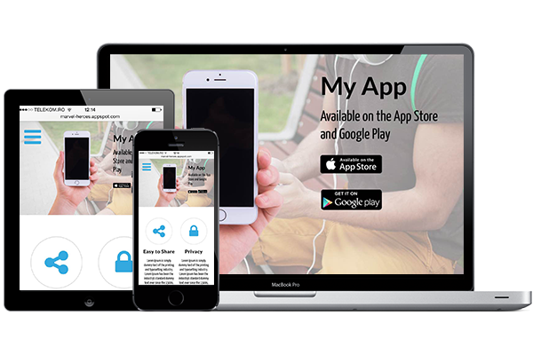
This tutorial explains how to use Google Chrome to view how your web application or website displays on different devices, such as Apple iPhone, iPad, Amazon Kindle, Google Nexus, LG Optimus, Nokia Lumia, Samsung Galaxy or Laptop with different resolutions.
Follow the steps below or click through the demo at the end of this article for a more visual explanation.
1
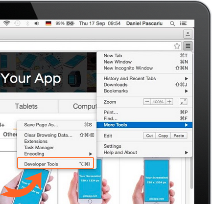
Open the Developer Tools in Google Chrome
To do so, click the Customise Icon on the top-right-side of Google Chrome. From the menu choose More Tools —> Developer Tools.
This will open the developer panel at the bottom of the screen.
To do so, click the Customise Icon on the top-right-side of Google Chrome. From the menu choose More Tools —> Developer Tools.
This will open the developer panel at the bottom of the screen.
2
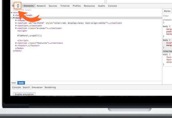
Toggle device mode
To do this, just click the small mobile device icon on the top-left-side of the developer panel.
This will show the Device toolbar at the top of the browser window.
To do this, just click the small mobile device icon on the top-left-side of the developer panel.
This will show the Device toolbar at the top of the browser window.
3
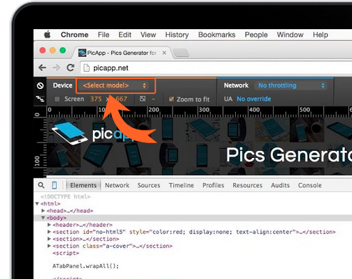
Display your webpage on different devices
In the Device toolbar, select the device you want to see how your web application displays on. You might need to Refresh the page for this to work correctly.
You can also switch between Portrait and Landscape mode and choose different Network characteristics.
In the Device toolbar, select the device you want to see how your web application displays on. You might need to Refresh the page for this to work correctly.
You can also switch between Portrait and Landscape mode and choose different Network characteristics.
Clickable Tutorial - click the orange hotspots to navigate