This article presents 3 simple ways to test your website or web app on different mobile devices, in the browser. The three testing options described here are: Safari's Responsive Design Mode, Chrome's Developer Mode and AppDemoStore's Online Simulator.
1 Safari's Responsive Design Mode
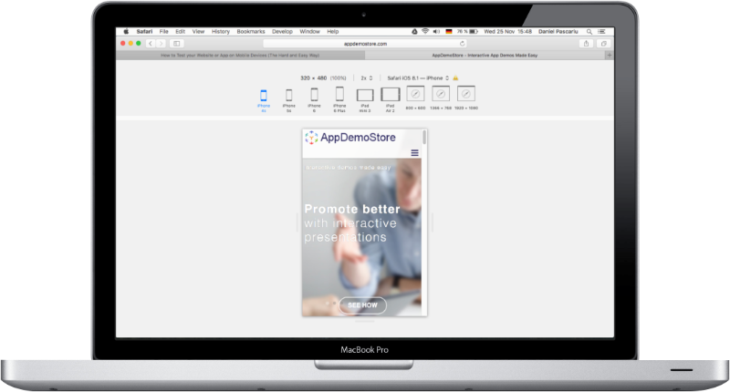
The Responsive Design Mode in the latest Safari version (9.0.1) lets you view how a website displays on different devices: iPhone 4s, iPhone 5s, iPhone 6, iPhone 6 Plus, iPad Mini 3, iPad Air 2, 800 x 600, 1366 x 768 and 1920 x 1080.
To access it click Develop in the Safari upper menu and select Enter Responsive Design Mode. Once you are in the Responsive Design Mode, the browser screen will look like in the image above.
2 Chrome's Developer Mode
To access Chrome's Developer Mode follow these steps:
- Click View in Chrome's upper menu and select Developer —> Developer Tools from the list.
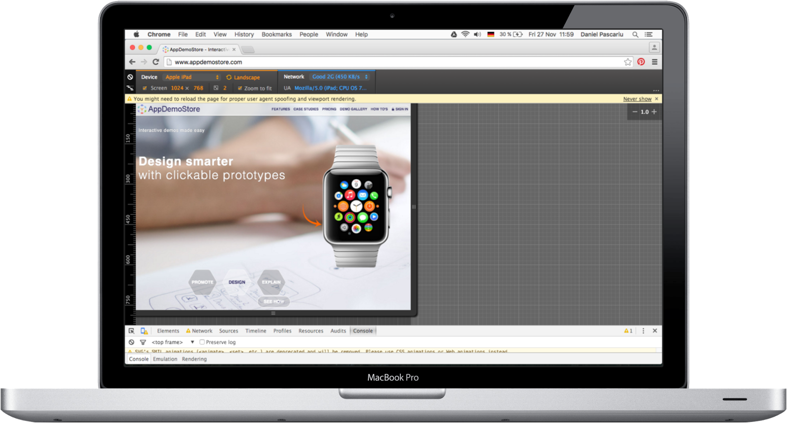
- In the Developer Console (that opens at the the bottom of the page) click Toggle Device Mode (the small device icon in the top-left of the console window).
- The Device Mode looks like in the image above and allows you to test your website or web app on different devices.
Advantages of Chrome compared to Safari:
- More devices: Amazon Kindle Fire, Apple iPad Mini, iPhone 4, 5, 6, 6 Plus, Blackberry PlayBook and Z30, Google Nexus 4, 5, 6, 7, 10, LG Optimus, Laptop, Nokia Lumia 520 and N9, Samsung Galaxy Note 2 and 3, Samsung Galaxy S3 and S4.
- Network simulation (GPRS, 3G, 4G, DSL, WiFi).
- Switch between Landscape and Portrait mode.
3 AppDemoStore's Web App Online Simulator
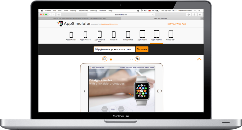
Although Chrome and Safari's testing features work great, they are missing the possibility to share a certain testing scenario with your colleagues. For example, if you find some issue in the way a website or web app displays on the iPhone in landscape-mode, you might want to share it with the responsible team. Our Web App Online Simulator allows you to do this.
Advantages of the Web App Online Simulator compared to Chrome and Safari:
- Can be accessed from the browser with a simple link: Web App Online Simulator.
- It's easy to use (just select a device, type your URL and done).
- You can test your website or web app on a variety of mainstream devices.
- You can easily switch between Landscape and Portrait mode.
- You can easily share a certain scenario (URL + device) with your colleagues via a generated URL.
Next time you need to test your new web app or website on a mobile device you don't have, give Web App Online Simulator a try.